
Automate Your (Boring!) Excel Reporting with Python!
Create Excel Reports (Including Charts!) Without Ever Touching Excel!

There’s no escaping Excel — and that’s ok!
Excel is everywhere. There’s no escaping it, even with powerful tools like Python at your disposal.
And that’s ok! Your boss and your colleagues still need easy ways to access important data.
But that doesn’t mean that you can’t make your work with Excel easier by using Python, all without touching Excel!
Automating Your Excel Reporting with Python
You know those Excel reports you do on a monthly, weekly (daily?) basis? The ones where you do the same thing four or five times for different clients?
Let Python do that for you!
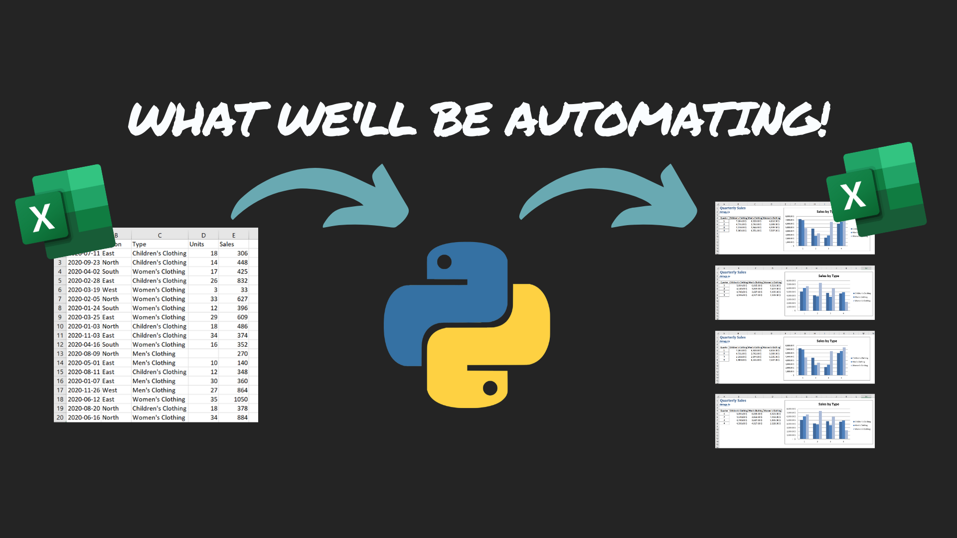
What We’ll Be Automating
Let’s take a quick look at what we’ll be automating! We’re going to be using previous data
The data format matches what you might expect to get from a corporate database with client sales on it.
We’re going to be breaking that data out by region and creating two summary tables, with formatting and with charts. All without ever touching Excel!
Let’s Load Our Libraries
We’re going to be relying on Pandas and Openpyxl.
# Section 1 - Loading our Libraries
import pandas as pd
from openpyxl import load_workbook
from openpyxl.styles import Font
from openpyxl.chart import BarChart, Reference
We’re going to be using two libraries:
Pandas takes care of transforming our data and creating the initial Excel files
Openpyxl formats our workbooks and inserts charts
Loading our Data
Let’s load our data and take a quick look at what we’re working with!
As I mentioned, the data is meant to resemble what you might get from a corporate database system.
# Section 2 - Loading our Data
df  =  pd.read_excel('https://github.com/datagy/pivot_table_pandas/raw/master/sample_pivot.xlsx',  parse_dates=['Date'])
print(df.head())
Date Region Type Units Sales 0 2020-07-11 East Children’s Clothing 18.0 306 1 2020-09-23 North Children’s Clothing 14.0 448 2 2020-04-02 South Women’s Clothing 17.0 425 3 2020-02-28 East Children’s Clothing 26.0 832 4 2020-03-19 West Women’s Clothing 3.0 33
Here, we’re using pandas to read an Excel file, parsing the Date column as dates.
Creating Our Pivot Table
Let’s create the summary table we will want in our final reports.
To sample, this let’s create a pivot table just for the East region to try out our code.
#Section 3 - Testing Pivot Tables
filtered = df[df['Region'] == 'East']
quarterly_sales = pd.pivot_table(filtered, index = filtered['Date'].dt.quarter, columns = 'Type', values = 'Sales', aggfunc='sum')
print("Quarterly Sales Pivot Table:")
print(quarterly_sales.head())
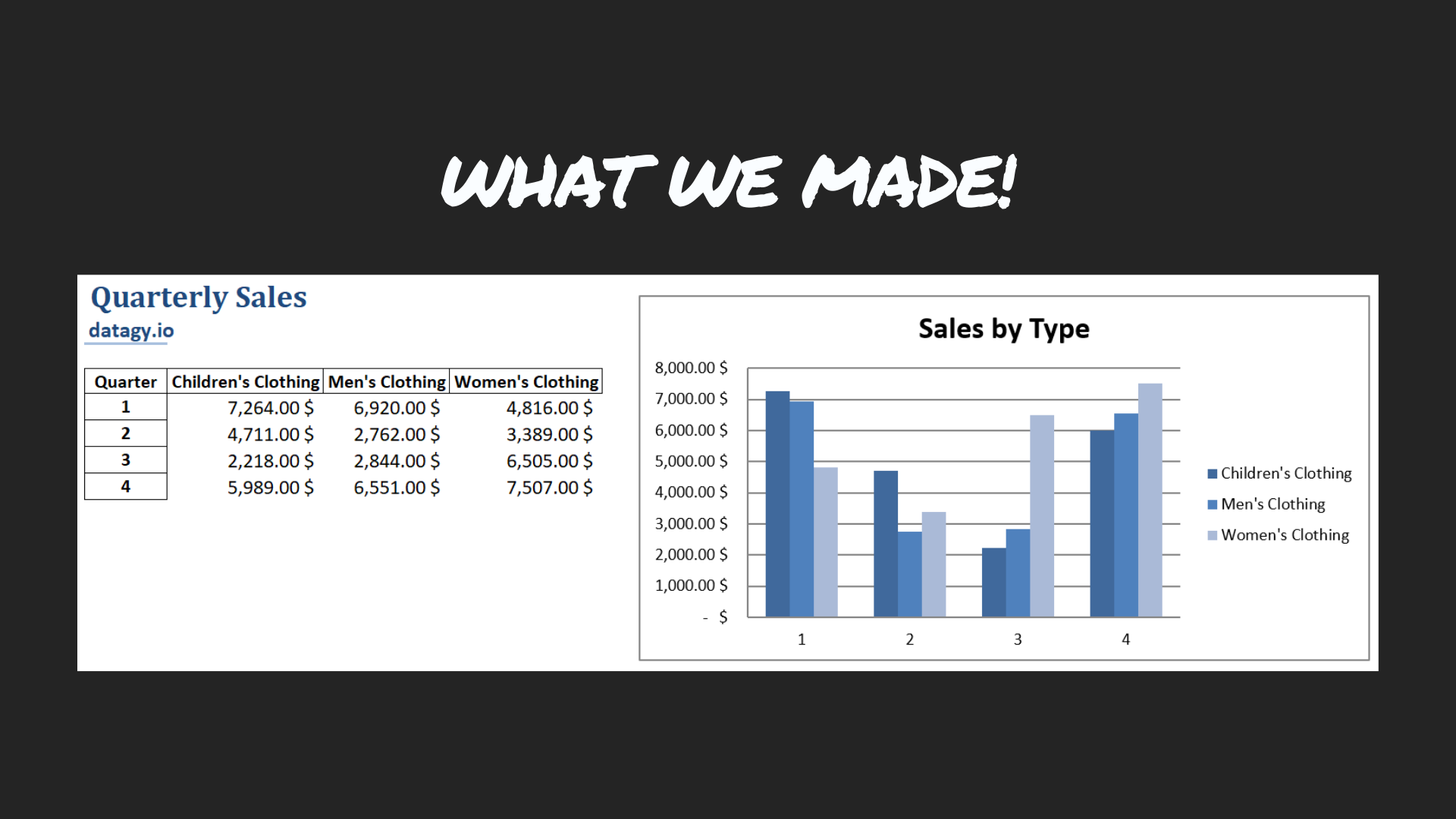
#Quarterly Sales Pivot Table:
#Type Children's Clothing Men's Clothing Women's Clothing
#Date
#1 12274 13293 16729
#2 5496 17817 22384
#3 14463 9622 15065
#4 13616 10953 16051
Creating Our First Excel File
Now that we have our pivot table, let’s load it into an Excel file.
For this, we’ll use pandas to load it:
# Section 04 - Creating and Excel Workbook
file_path = #Path to where you want your file saved
quarterly_sales.to_excel(file_path, sheet_name = 'Quarterly Sales', startrow=3)
Let’s take a quick look as to what we’re doing:
We create a file path variable to identify where we want the file to be stored,
We use ExcelWriter to save the file
We save both Pivot Tables to separate worksheets, starting at row 3 (to leave from for headers later on)
Making Our Report Prettier
Pandas is good for getting the data to Excel. Now that it’s there, let’s pretty it up a bit and add some visualizations.
# Section 05 - Loading the Workbook
wb = load_workbook(file_path)
sheet1 = wb['Quarterly Sales']

# Section 06 - Formatting the First Sheet
sheet1['A1'] = 'Quarterly Sales'
sheet1['A2'] = 'datagy.io'
sheet1['A4'] = 'Quarter'
sheet1['A1'].style = 'Title'
sheet1['A2'].style = 'Headline 2'

for i in range(5, 9):
sheet1[f'B{i}'].style='Currency'
sheet1[f'C{i}'].style='Currency'
sheet1[f'D{i}'].style='Currency'

# Section 07 - Adding a Bar Chart
bar_chart = BarChart()
data = Reference(sheet1, min_col=2, max_col=4, min_row=4, max_row=8)
categories = Reference(sheet1, min_col=1, max_col=1, min_row=5, max_row=8)
bar_chart.add_data(data, titles_from_data=True)
bar_chart.set_categories(categories)

sheet1.add_chart(bar_chart, "F4")
bar_chart.title = 'Sales by Type'
bar_chart.style = 3
wb.save(filename = file_path)
There’s quite a bit going on here. Let’s explore it in more detail!
In Section 5, we’re loading the workbook and worksheets into separate objects that Openpyxl can handle.
Section 6 has a bit more going on:
We add a title and subtitle to sheet1 in cells A1 and A2.
We change the header of the quarters column to be more reflective of the data.
We apply styles to our titles and subtitles.
We change the cells in our financial fields to currency. This needs to be applied to a single cell at a time. This is why we use a for loop.
In Section 7, we add our bar chart:
We create a BarChart object and identify the fields in which our data and categories are stored.
The data and categories are then applied to the object.
Finally, we add a descriptive title and style. Openpyxl uses a number of different styles — try them all out!
This is what our sheet looks like now:
Automating this Workflow for Multiple Workbooks
While this is already handy, doing this for one region only saves us a little bit of time. Let’s do this for all regions with a for-loop.
# Section 08 - Getting Region Names
regions = list(df['Region'].unique())

# Section 09 - Looping Over All Regions
folder_path = #Insert the path to the folder you want to save the reports in
for region in regions:
filtered = df[df['Region'] == f'{region}']
quarterly_sales = pd.pivot_table(filtered, index = filtered['Date'].dt.quarter, columns = 'Type', values = 'Sales', aggfunc='sum')
file_path = f"{path to your folder}{region}.xlsx"
quarterly_sales.to_excel(file_path, sheet_name = 'Quarterly Sales', startrow=3)
wb = load_workbook(file_path)
sheet1 = wb['Quarterly Sales']
sheet1['A1'] = 'Quarterly Sales'
sheet1['A2'] = 'datagy.io'
sheet1['A4'] = 'Quarter'
sheet1['A1'].style = 'Title'
sheet1['A2'].style = 'Headline 2'

for i in range(5, 10):
sheet1[f'B{i}'].style='Currency'
sheet1[f'C{i}'].style='Currency'
sheet1[f'D{i}'].style='Currency'
bar_chart = BarChart()
data = Reference(sheet1, min_col=2, max_col=4, min_row=4, max_row=8)
categories = Reference(sheet1, min_col=1, max_col=1, min_row=5, max_row=8)
bar_chart.add_data(data, titles_from_data=True)
bar_chart.set_categories(categories)
sheet1.add_chart(bar_chart, "F4")
bar_chart.title = 'Sales by Type'
bar_chart.style = 3
wb.save(file_path)
Let’s take a closer look here:
In Section 8, we create a list that has all the unique values of the different regions we want to cover.
In Section 9, we repeat our earlier code in a for-loop:
We create a new variable that holds the path to the folder we want to save our files in.
Later, we use f-strings to insert the region names into our script to make it dynamic to each region.
What Next?
The nice thing about Python is how scaleable it makes repetitive tasks.
Imagine getting this file daily and having to create these workbooks every day. You’ve just saved yourself a good chunk of time every day!
Conclusion
We learned quite a bit in this short tutorial! We transformed a workbook into a set of pivot tables, exported those into separate workbooks, and applied formatting and graphs to each workbook!
Give yourself a pat on the back!