Data Visualization in Python 3
Third tutorial of Data Visualization in Python using Google Colab.


- Pie Charts, Box Plots, Scatter Plots, and Bubble Plots
- Exploring Datasets with pandas and Matplotlib
- Downloading and Prepping Data
- Visualizing Data using Matplotlib
- Pie Charts
- Box Plots
- Scatter Plots
- Bubble Plots
Exploring Datasets with pandas and Matplotlib
Toolkits: The course heavily relies on pandas and Numpy for data wrangling, analysis, and visualization. The primary plotting library we will explore in the course is Matplotlib.
Dataset: Immigration to Canada from 1980 to 2013 - International migration flows to and from selected countries - The 2015 revision from United Nation's website.
The dataset contains annual data on the flows of international migrants as recorded by the countries of destination. The data presents both inflows and outflows according to the place of birth, citizenship or place of previous / next residence both for foreigners and nationals. In this lab, we will focus on the Canadian Immigration data.
Import primary modules.
import numpy as np  # useful for many scientific computing in Python
import pandas as pd # primary data structure library
Let's download and import our primary Canadian Immigration dataset using pandas read_excel() method. Normally, before we can do that, we would need to download a module which pandas requires to read in excel files. This module is xlrd. For your convenience, we have pre-installed this module, so you would not have to worry about that. Otherwise, you would need to run the following line of code to install the xlrd module:
!conda install -c anaconda xlrd --yesDownload the dataset and read it into a pandas dataframe.
df_can = pd.read_excel('https://s3-api.us-geo.objectstorage.softlayer.net/cf-courses-data/CognitiveClass/DV0101EN/labs/Data_Files/Canada.xlsx',
                       sheet_name='Canada by Citizenship',
                       skiprows=range(20),
                       skipfooter=2
                      )

print('Data downloaded and read into a dataframe!')
Let's take a look at the first five items in our dataset.
df_can.head()
Let's find out how many entries there are in our dataset.
# print the dimensions of the dataframe
print(df_can.shape)
Clean up data. We will make some modifications to the original dataset to make it easier to create our visualizations. Refer to Introduction to Matplotlib and Line Plots and Area Plots, Histograms, and Bar Plots for a detailed description of this preprocessing.
# clean up the dataset to remove unnecessary columns (eg. REG)
df_can.drop(['AREA', 'REG', 'DEV', 'Type', 'Coverage'], axis=1, inplace=True)

# let's rename the columns so that they make sense
df_can.rename(columns={'OdName':'Country', 'AreaName':'Continent','RegName':'Region'}, inplace=True)

# for sake of consistency, let's also make all column labels of type string
df_can.columns = list(map(str, df_can.columns))

# set the country name as index - useful for quickly looking up countries using .loc method
df_can.set_index('Country', inplace=True)

# add total column
df_can['Total'] = df_can.sum(axis=1)

# years that we will be using in this lesson - useful for plotting later on
years = list(map(str, range(1980, 2014)))
print('data dimensions:', df_can.shape)
Import Matplotlib.
%matplotlib inline

import matplotlib as mpl
import matplotlib.pyplot as plt

mpl.style.use('ggplot') # optional: for ggplot-like style

# check for latest version of Matplotlib
print('Matplotlib version: ', mpl.__version__) # >= 2.0.0
Pie Charts
A pie chart is a circualr graphic that displays numeric proportions by dividing a circle (or pie) into proportional slices. You are most likely already familiar with pie charts as it is widely used in business and media. We can create pie charts in Matplotlib by passing in the kind=pie keyword.
Let's use a pie chart to explore the proportion (percentage) of new immigrants grouped by continents for the entire time period from 1980 to 2013.
Step 1: Gather data.
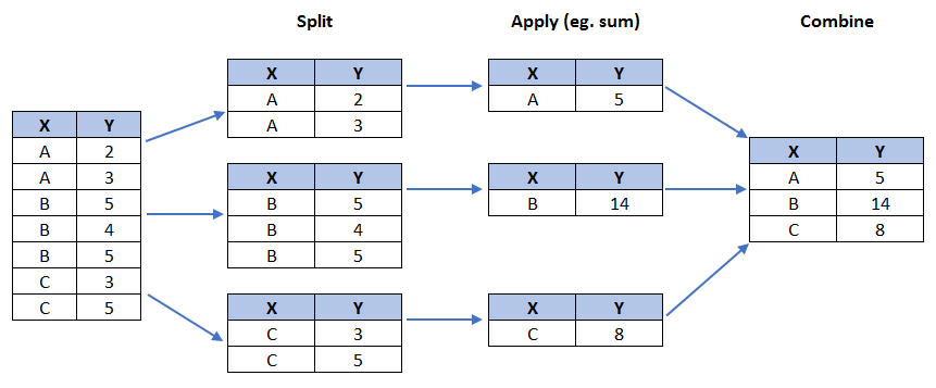
We will use pandas groupby method to summarize the immigration data by Continent. The general process of groupby involves the following steps:
- Split: Splitting the data into groups based on some criteria.
-
Apply: Applying a function to each group independently:
.sum() .count() .mean() .std() .aggregate() .apply() .etc.. - Combine: Combining the results into a data structure.
# group countries by continents and apply sum() function
df_continents = df_can.groupby('Continent', axis=0).sum()

# note: the output of the groupby method is a `groupby' object.
# we can not use it further until we apply a function (eg .sum())
print(type(df_can.groupby('Continent', axis=0)))

df_continents.head()
Step 2: Plot the data. We will pass in kind = 'pie' keyword, along with the following additional parameters:
-
autopct- is a string or function used to label the wedges with their numeric value. The label will be placed inside the wedge. If it is a format string, the label will befmt%pct. -
startangle- rotates the start of the pie chart by angle degrees counterclockwise from the x-axis. -
shadow- Draws a shadow beneath the pie (to give a 3D feel).
# autopct create %, start angle represent starting point
df_continents['Total'].plot(kind='pie',
                            figsize=(5, 6),
                            autopct='%1.1f%%', # add in percentages
                            startangle=90,     # start angle 90° (Africa)
                            shadow=True,       # add shadow
                            )

plt.title('Immigration to Canada by Continent [1980 - 2013]')
plt.axis('equal') # Sets the pie chart to look like a circle.

plt.show()

The above visual is not very clear, the numbers and text overlap in some instances. Let's make a few modifications to improve the visuals:
- Remove the text labels on the pie chart by passing in
legendand add it as a seperate legend usingplt.legend(). - Push out the percentages to sit just outside the pie chart by passing in
pctdistanceparameter. - Pass in a custom set of colors for continents by passing in
colorsparameter. -
Explode the pie chart to emphasize the lowest three continents (Africa, North America, and Latin America and Carribbean) by pasing in
explodeparameter.
colors_list = ['gold', 'yellowgreen', 'lightcoral', 'lightskyblue', 'lightgreen', 'pink']
explode_list = [0.1, 0, 0, 0, 0.1, 0.1] # ratio for each continent with which to offset each wedge.

df_continents['Total'].plot(kind='pie',
                            figsize=(15, 6),
                            autopct='%1.1f%%',
                            startangle=90,
                            shadow=True,
                            labels=None,         # turn off labels on pie chart
                            pctdistance=1.12,    # the ratio between the center of each pie slice and the start of the text generated by autopct
                            colors=colors_list,  # add custom colors
                            explode=explode_list # 'explode' lowest 3 continents
                            )

# scale the title up by 12% to match pctdistance
plt.title('Immigration to Canada by Continent [1980 - 2013]', y=1.12)

plt.axis('equal')

# add legend
plt.legend(labels=df_continents.index, loc='upper left')

plt.show()

Question: Using a pie chart, explore the proportion (percentage) of new immigrants grouped by continents in the year 2013.
Note: You might need to play with the explore values in order to fix any overlapping slice values.
explode_list = [0.1, 0, 0, 0, 0.1, 0.2] # ratio for each continent with which to offset each wedge.

df_continents['2013'].plot(kind='pie',
                            figsize=(15, 6),
                            autopct='%1.1f%%',
                            startangle=90,
                            shadow=True,
                            labels=None,                 # turn off labels on pie chart
                            pctdistance=1.12,            # the ratio between the pie center and start of text label
                            explode=explode_list         # 'explode' lowest 3 continents
                            )

# scale the title up by 12% to match pctdistance
plt.title('Immigration to Canada by Continent in 2013', y=1.12)
plt.axis('equal')

# add legend
plt.legend(labels=df_continents.index, loc='upper left')

# show plot
plt.show()

Box Plots
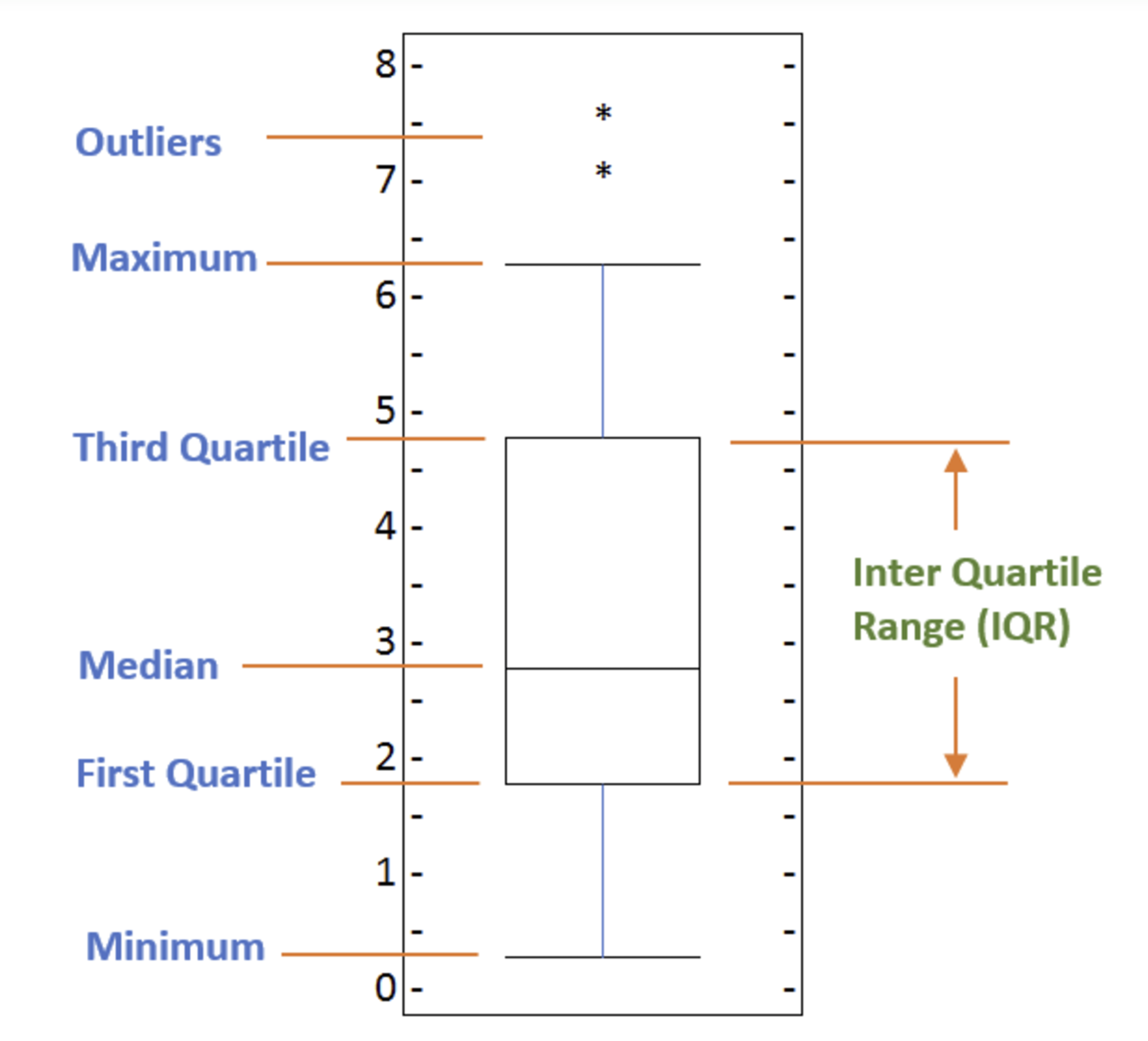
A box plot is a way of statistically representing the distribution of the data through five main dimensions:
- Minimun: Smallest number in the dataset.
-
First quartile: Middle number between the
minimumand themedian. - Second quartile (Median): Middle number of the (sorted) dataset.
-
Third quartile: Middle number between
medianandmaximum. - Maximum: Highest number in the dataset.
To make a box plot, we can use kind=box in plot method invoked on a pandas series or dataframe.
Let's plot the box plot for the Japanese immigrants between 1980 - 2013.
Step 1: Get the dataset. Even though we are extracting the data for just one country, we will obtain it as a dataframe. This will help us with calling the dataframe.describe() method to view the percentiles.
# to get a dataframe, place extra square brackets around 'Japan'.
df_japan = df_can.loc[['Japan'], years].transpose()
df_japan.head()
Step 2: Plot by passing in kind='box'.
df_japan.plot(kind='box', figsize=(8, 6))

plt.title('Box plot of Japanese Immigrants from 1980 - 2013')
plt.ylabel('Number of Immigrants')

plt.show()

We can immediately make a few key observations from the plot above:
- The minimum number of immigrants is around 200 (min), maximum number is around 1300 (max), and median number of immigrants is around 900 (median).
- 25% of the years for period 1980 - 2013 had an annual immigrant count of ~500 or fewer (First quartile).
- 75% of the years for period 1980 - 2013 had an annual immigrant count of ~1100 or fewer (Third quartile).
We can view the actual numbers by calling the describe() method on the dataframe.
df_japan.describe()
One of the key benefits of box plots is comparing the distribution of multiple datasets. In one of the previous labs, we observed that China and India had very similar immigration trends. Let's analyize these two countries further using box plots.
Question: Compare the distribution of the number of new immigrants from India and China for the period 1980 - 2013.
Step 1: Get the dataset for China and India and call the dataframe df_CI.
df_CI= df_can.loc[['China', 'India'], years].transpose()
df_CI.head()
Let's view the percentages associated with both countries using the describe() method.
df_CI.describe()
Step 2: Plot data.
df_CI.plot(kind='box', figsize=(10, 7))

plt.title('Box plots of Immigrants from China and India (1980 - 2013)')
plt.xlabel('Number of Immigrants')

plt.show()

We can observe that, while both countries have around the same median immigrant population (~20,000), China's immigrant population range is more spread out than India's. The maximum population from India for any year (36,210) is around 15% lower than the maximum population from China (42,584).
If you prefer to create horizontal box plots, you can pass the vert parameter in the plot function and assign it to False. You can also specify a different color in case you are not a big fan of the default red color.
# horizontal box plots
df_CI.plot(kind='box', figsize=(10, 7), color='blue', vert=False)

plt.title('Box plots of Immigrants from China and India (1980 - 2013)')
plt.xlabel('Number of Immigrants')

plt.show()

Subplots
Often times we might want to plot multiple plots within the same figure. For example, we might want to perform a side by side comparison of the box plot with the line plot of China and India's immigration.
To visualize multiple plots together, we can create a figure (overall canvas) and divide it into subplots, each containing a plot. With subplots, we usually work with the artist layer instead of the scripting layer.
Typical syntax is :
fig = plt.figure() # create figure
    ax = fig.add_subplot(nrows, ncols, plot_number) # create subplots
Where
-
nrowsandncolsare used to notionally split the figure into (nrows*ncols) sub-axes, -
plot_numberis used to identify the particular subplot that this function is to create within the notional grid.plot_numberstarts at 1, increments across rows first and has a maximum ofnrows*ncolsas shown below.
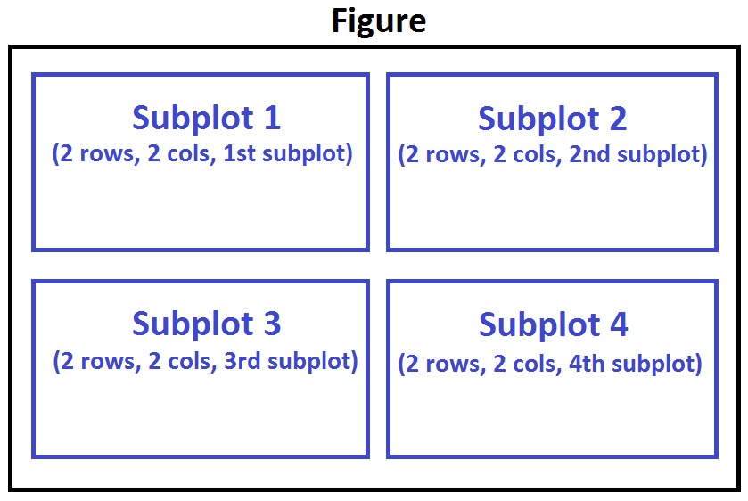
We can then specify which subplot to place each plot by passing in the ax paramemter in plot() method as follows:
fig = plt.figure() # create figure

ax0 = fig.add_subplot(1, 2, 1) # add subplot 1 (1 row, 2 columns, first plot)
ax1 = fig.add_subplot(1, 2, 2) # add subplot 2 (1 row, 2 columns, second plot). See tip below**

# Subplot 1: Box plot
df_CI.plot(kind='box', color='blue', vert=False, figsize=(20, 6), ax=ax0) # add to subplot 1
ax0.set_title('Box Plots of Immigrants from China and India (1980 - 2013)')
ax0.set_xlabel('Number of Immigrants')
ax0.set_ylabel('Countries')

# Subplot 2: Line plot
df_CI.plot(kind='line', figsize=(20, 6), ax=ax1) # add to subplot 2
ax1.set_title ('Line Plots of Immigrants from China and India (1980 - 2013)')
ax1.set_ylabel('Number of Immigrants')
ax1.set_xlabel('Years')

plt.show()

* Tip regarding subplot convention
In the case when nrows, ncols, and plot_number are all less than 10, a convenience exists such that the a 3 digit number can be given instead, where the hundreds represent nrows, the tens represent ncols and the units represent plot_number. For instance,
subplot(211) == subplot(2, 1, 1)
produces a subaxes in a figure which represents the top plot (i.e. the first) in a 2 rows by 1 column notional grid (no grid actually exists, but conceptually this is how the returned subplot has been positioned).
Let's try something a little more advanced.
Previously we identified the top 15 countries based on total immigration from 1980 - 2013.
Question: Create a box plot to visualize the distribution of the top 15 countries (based on total immigration) grouped by the decades 1980s, 1990s, and 2000s.
Step 1: Get the dataset. Get the top 15 countries based on Total immigrant population. Name the dataframe df_top15.
df_top15 = df_can.sort_values(['Total'], ascending=False, axis=0).head(15)
df_top15
Step 2: Create a new dataframe which contains the aggregate for each decade. One way to do that:
- Create a list of all years in decades 80's, 90's, and 00's.
- Slice the original dataframe df_can to create a series for each decade and sum across all years for each country.
- Merge the three series into a new data frame. Call your dataframe new_df.
# create a list of all years in decades 80's, 90's, and 00's
years_80s = list(map(str, range(1980, 1990)))
years_90s = list(map(str, range(1990, 2000)))
years_00s = list(map(str, range(2000, 2010)))

# slice the original dataframe df_can to create a series for each decade
df_80s = df_top15.loc[:, years_80s].sum(axis=1)
df_90s = df_top15.loc[:, years_90s].sum(axis=1)
df_00s = df_top15.loc[:, years_00s].sum(axis=1)

# merge the three series into a new data frame
new_df = pd.DataFrame({'1980s': df_80s, '1990s': df_90s, '2000s':df_00s})

# display dataframe
new_df.head()
Let's learn more about the statistics associated with the dataframe using the describe() method.
new_df.describe()
Step 3: Plot the box plots.
new_df.plot(kind='box', figsize=(10, 6))

plt.title('Immigration from top 15 countries for decades 80s, 90s and 2000s')

plt.show()

Note how the box plot differs from the summary table created. The box plot scans the data and identifies the outliers. In order to be an outlier, the data value must be:
- larger than Q3 by at least 1.5 times the interquartile range (IQR), or,
- smaller than Q1 by at least 1.5 times the IQR.
Let's look at decade 2000s as an example:
- Q1 (25%) = 36,101.5
- Q3 (75%) = 105,505.5
- IQR = Q3 - Q1 = 69,404
Using the definition of outlier, any value that is greater than Q3 by 1.5 times IQR will be flagged as outlier.
Outlier > 105,505.5 + (1.5 * 69,404)
Outlier > 209,611.5
# let's check how many entries fall above the outlier threshold
new_df[new_df['2000s']> 209611.5]
China and India are both considered as outliers since their population for the decade exceeds 209,611.5.
The box plot is an advanced visualizaiton tool, and there are many options and customizations that exceed the scope of this lab. Please refer to Matplotlib documentation on box plots for more information.
Scatter Plots
A scatter plot (2D) is a useful method of comparing variables against each other. Scatter plots look similar to line plots in that they both map independent and dependent variables on a 2D graph. While the datapoints are connected together by a line in a line plot, they are not connected in a scatter plot. The data in a scatter plot is considered to express a trend. With further analysis using tools like regression, we can mathematically calculate this relationship and use it to predict trends outside the dataset.
Let's start by exploring the following:
Using a scatter plot, let's visualize the trend of total immigrantion to Canada (all countries combined) for the years 1980 - 2013.
Step 1: Get the dataset. Since we are expecting to use the relationship betewen years and total population, we will convert years to int type.
# we can use the sum() method to get the total population per year
df_tot = pd.DataFrame(df_can[years].sum(axis=0))

# change the years to type int (useful for regression later on)
df_tot.index = map(int, df_tot.index)

# reset the index to put in back in as a column in the df_tot dataframe
df_tot.reset_index(inplace = True)

# rename columns
df_tot.columns = ['year', 'total']

# view the final dataframe
df_tot.head()
Step 2: Plot the data. In Matplotlib, we can create a scatter plot set by passing in kind='scatter' as plot argument. We will also need to pass in x and y keywords to specify the columns that go on the x- and the y-axis.
df_tot.plot(kind='scatter', x='year', y='total', figsize=(10, 6), color='darkblue')

plt.title('Total Immigration to Canada from 1980 - 2013')
plt.xlabel('Year')
plt.ylabel('Number of Immigrants')

plt.show()

Notice how the scatter plot does not connect the datapoints together. We can clearly observe an upward trend in the data: as the years go by, the total number of immigrants increases. We can mathematically analyze this upward trend using a regression line (line of best fit).
So let's try to plot a linear line of best fit, and use it to predict the number of immigrants in 2015.
Step 1: Get the equation of line of best fit. We will use Numpy's polyfit() method by passing in the following:
-
x: x-coordinates of the data. -
y: y-coordinates of the data. -
deg: Degree of fitting polynomial. 1 = linear, 2 = quadratic, and so on.
x = df_tot['year']      # year on x-axis
y = df_tot['total']     # total on y-axis
fit = np.polyfit(x, y, deg=1)

fit
The output is an array with the polynomial coefficients, highest powers first. Since we are plotting a linear regression y= a*x + b, our output has 2 elements [5.56709228e+03, -1.09261952e+07] with the the slope in position 0 and intercept in position 1.
Step 2: Plot the regression line on the scatter plot.
df_tot.plot(kind='scatter', x='year', y='total', figsize=(10, 6), color='darkblue')

plt.title('Total Immigration to Canada from 1980 - 2013')
plt.xlabel('Year')
plt.ylabel('Number of Immigrants')

# plot line of best fit
plt.plot(x, fit[0] * x + fit[1], color='red') # recall that x is the Years
plt.annotate('y={0:.0f} x + {1:.0f}'.format(fit[0], fit[1]), xy=(2000, 150000))

plt.show()

# print out the line of best fit
'No. Immigrants = {0:.0f} * Year + {1:.0f}'.format(fit[0], fit[1])

Using the equation of line of best fit, we can estimate the number of immigrants in 2015:
No. Immigrants = 5567 * Year - 10926195
No. Immigrants = 5567 * 2015 - 10926195
No. Immigrants = 291,310
When compared to the actuals from Citizenship and Immigration Canada's (CIC) 2016 Annual Report, we see that Canada accepted 271,845 immigrants in 2015. Our estimated value of 291,310 is within 7% of the actual number, which is pretty good considering our original data came from United Nations (and might differ slightly from CIC data).
As a side note, we can observe that immigration took a dip around 1993 - 1997. Further analysis into the topic revealed that in 1993 Canada introcuded Bill C-86 which introduced revisions to the refugee determination system, mostly restrictive. Further amendments to the Immigration Regulations cancelled the sponsorship required for "assisted relatives" and reduced the points awarded to them, making it more difficult for family members (other than nuclear family) to immigrate to Canada. These restrictive measures had a direct impact on the immigration numbers for the next several years.
Question: Create a scatter plot of the total immigration from Denmark, Norway, and Sweden to Canada from 1980 to 2013?
Step 1: Get the data:
- Create a dataframe the consists of the numbers associated with Denmark, Norway, and Sweden only. Name it df_countries.
- Sum the immigration numbers across all three countries for each year and turn the result into a dataframe. Name this new dataframe df_total.
- Reset the index in place.
- Rename the columns to year and total.
- Display the resulting dataframe.
# create df_countries dataframe
df_countries = df_can.loc[['Denmark', 'Norway', 'Sweden'], years].transpose()

# create df_total by summing across three countries for each year
df_total = pd.DataFrame(df_countries.sum(axis=1))

# reset index in place
df_total.reset_index(inplace=True)

# rename columns
df_total.columns = ['year', 'total']

# change column year from string to int to create scatter plot
df_total['year'] = df_total['year'].astype(int)

# show resulting dataframe
df_total.head()
Step 2: Generate the scatter plot by plotting the total versus year in df_total.
# generate scatter plot
df_total.plot(kind='scatter', x='year', y='total', figsize=(10, 6), color='darkblue')

# add title and label to axes
plt.title('Immigration from Denmark, Norway, and Sweden to Canada from 1980 - 2013')
plt.xlabel('Year')
plt.ylabel('Number of Immigrants')

# show plot
plt.show()

Bubble Plots
A bubble plot is a variation of the scatter plot that displays three dimensions of data (x, y, z). The datapoints are replaced with bubbles, and the size of the bubble is determined by the third variable 'z', also known as the weight. In maplotlib, we can pass in an array or scalar to the keyword s to plot(), that contains the weight of each point.
Let's start by analyzing the effect of Argentina's great depression.
Argentina suffered a great depression from 1998 - 2002, which caused widespread unemployment, riots, the fall of the government, and a default on the country's foreign debt. In terms of income, over 50% of Argentines were poor, and seven out of ten Argentine children were poor at the depth of the crisis in 2002.
Let's analyze the effect of this crisis, and compare Argentina's immigration to that of it's neighbour Brazil. Let's do that using a bubble plot of immigration from Brazil and Argentina for the years 1980 - 2013. We will set the weights for the bubble as the normalized value of the population for each year.
Step 1: Get the data for Brazil and Argentina. Like in the previous example, we will convert the Years to type int and bring it in the dataframe.
df_can_t = df_can[years].transpose() # transposed dataframe

# cast the Years (the index) to type int
df_can_t.index = map(int, df_can_t.index)

# let's label the index. This will automatically be the column name when we reset the index
df_can_t.index.name = 'Year'

# reset index to bring the Year in as a column
df_can_t.reset_index(inplace=True)

# view the changes
df_can_t.head()
Step 2: Create the normalized weights.
There are several methods of normalizations in statistics, each with its own use. In this case, we will use feature scaling to bring all values into the range [0,1]. The general formula is:
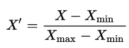
where X is an original value, X' is the normalized value. The formula sets the max value in the dataset to 1, and sets the min value to 0. The rest of the datapoints are scaled to a value between 0-1 accordingly.
# normalize Brazil data
norm_brazil = (df_can_t['Brazil'] - df_can_t['Brazil'].min()) / (df_can_t['Brazil'].max() - df_can_t['Brazil'].min())

# normalize Argentina data
norm_argentina = (df_can_t['Argentina'] - df_can_t['Argentina'].min()) / (df_can_t['Argentina'].max() - df_can_t['Argentina'].min())
Step 3: Plot the data.
- To plot two different scatter plots in one plot, we can include the axes one plot into the other by passing it via the
axparameter. - We will also pass in the weights using the
sparameter. Given that the normalized weights are between 0-1, they won't be visible on the plot. Therefore we will:- multiply weights by 2000 to scale it up on the graph, and,
- add 10 to compensate for the min value (which has a 0 weight and therefore scale with x2000).
# Brazil
ax0 = df_can_t.plot(kind='scatter',
                    x='Year',
                    y='Brazil',
                    figsize=(14, 8),
                    alpha=0.5,                  # transparency
                    color='green',
                    s=norm_brazil * 2000 + 10,  # pass in weights
                    xlim=(1975, 2015)
                   )

# Argentina
ax1 = df_can_t.plot(kind='scatter',
                    x='Year',
                    y='Argentina',
                    alpha=0.5,
                    color="blue",
                    s=norm_argentina * 2000 + 10,
                    ax = ax0
                   )

ax0.set_ylabel('Number of Immigrants')
ax0.set_title('Immigration from Brazil and Argentina from 1980 - 2013')
ax0.legend(['Brazil', 'Argentina'], loc='upper left', fontsize='x-large')

The size of the bubble corresponds to the magnitude of immigrating population for that year, compared to the 1980 - 2013 data. The larger the bubble, the more immigrants in that year.
From the plot above, we can see a corresponding increase in immigration from Argentina during the 1998 - 2002 great depression. We can also observe a similar spike around 1985 to 1993. In fact, Argentina had suffered a great depression from 1974 - 1990, just before the onset of 1998 - 2002 great depression.
On a similar note, Brazil suffered the Samba Effect where the Brazilian real (currency) dropped nearly 35% in 1999. There was a fear of a South American financial crisis as many South American countries were heavily dependent on industrial exports from Brazil. The Brazilian government subsequently adopted an austerity program, and the economy slowly recovered over the years, culminating in a surge in 2010. The immigration data reflect these events.
Question: Previously in this lab, we created box plots to compare immigration from China and India to Canada. Create bubble plots of immigration from China and India to visualize any differences with time from 1980 to 2013. You can use df_can_t that we defined and used in the previous example.
Step 1: Normalize the data pertaining to China and India.
# normalize China data
norm_china = (df_can_t['China'] - df_can_t['China'].min()) / (df_can_t['China'].max() - df_can_t['China'].min())

# normalize India data
norm_india = (df_can_t['India'] - df_can_t['India'].min()) / (df_can_t['India'].max() - df_can_t['India'].min())
Step 2: Generate the bubble plots.
# China
ax0 = df_can_t.plot(kind='scatter',
                    x='Year',
                    y='China',
                    figsize=(14, 8),
                    alpha=0.5,                  # transparency
                    color='green',
                    s=norm_china * 2000 + 10,  # pass in weights
                    xlim=(1975, 2015)
                   )
# India
ax1 = df_can_t.plot(kind='scatter',
                    x='Year',
                    y='India',
                    alpha=0.5,
                    color="blue",
                    s=norm_india * 2000 + 10,
                    ax = ax0
                   )
ax0.set_ylabel('Number of Immigrants')
ax0.set_title('Immigration from China and India from 1980 - 2013')
ax0.legend(['China', 'India'], loc='upper left', fontsize='x-large')

Thank you for completing this lab!
This notebook was created by Jay Rajasekharan with contributions from Ehsan M. Kermani, and Slobodan Markovic.
This notebook was recently revamped by Alex Aklson. I hope you found this lab session interesting. Feel free to contact me if you have any questions!
This notebook is part of a course on Coursera called Data Visualization with Python. If you accessed this notebook outside the course, you can take this course online by clicking here.
Copyright © 2019 Cognitive Class. This notebook and its source code are released under the terms of the MIT License.